skip to main |
skip to sidebar
Simply Lemonade: Victorian and Art Nouveau
 (Label I redesigned)
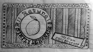 I decided to use the Simply Lemonade label to recreate in the Victorian style. I wanted it to have a variety of fonts, so I found fonts used during that time period and incorporated them into the label. I also wanted to include a picture of a lemon to relate with lemonade, as I did in the label below. Also, I noticed that product names seemed to stand out more boldly than the rest of the text, so I used capitals for the brand name. Many arcs, curves and angles were present in designs during the Victorian era. There were a lot of patterns and ornament used, too, so I also tried to use simple patterns in the label. A simple border was drawn to make the design more uniform; many designs from the Victorian era had elaborate borders.
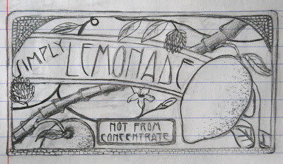 I decided to sketch a new design for the Simply Lemonade label in the style of Art Nouveau. I looked at a bunch of labels from Art Nouveau to get a better of how I wanted to design the label. I love the tiny stained-glass-looking squares from the style, so I wanted to incorporate it into my design. Since curves and floral designs were used with this style, I added some flowy-looking stems, leaves, and flowers. Two lemons are also present to relate with lemonade. I chose the type to relate well with the style, also. Around the entire design is a thin frame, which is seen around many of the Art Nouveau designs.
I really like how you have floral mixed in with your design. Floral was a big part of Art Nouveau and it really adds to the image. Also, the layout of the text and imagery seems very balanced. The texture on the bottom and the top edges brings closure to the logo. The typeface you chose is very interesting. Nice job.
ReplyDeleteThis is a really great packaging label. I love how much detail you put into all of the little tiny squares in the corners. I also like your use of typography and the layout of your design.
ReplyDeleteI really like the amount of detail you used and the font for the victorian label, it is very appropriate. Very good!
ReplyDelete