skip to main |
skip to sidebar
Simply Lemonade: Ver Sacrum, Peter Behrens, Futurism
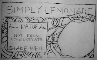 This is the Simply Lemonade label with a redesign influenced by the Vienna Secessionists. I drew a lemon in the center to relate with lemonde, as I did with the past designs. My concept behind the design was to create horizontal and vertical alignment with the words, add decoration, and create bold lines, just as the Vienna Secessionists did with Ver Sacrum designs. Vienna Secessionists used a lot of decorative/ornamental elements along the borers and within the backgrounds of their designs. They also use white space very well. Their text was hand-written (obviously mine is because it is a sketch); if I were to digitally create this image, I'd probably scan in hand-lettering. They used vertical and horizontal alignment. Along with this, color was added to the backgrounds.
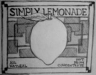 This is the Simply Lemonade label recreate with the influence of Peter Behrens. He used a a grid system to create geometric, precise symmetry and alignment. I tried to create a design in the background of the lemon that was horizontally symmetrical. Also, I wanted the border to be symetrical. The horizontal lines (below and above the text) are vertically symmetrical. I tried creating text that Peter Behrens invented, which was shown in Megg's History of Graphic design in Chapter 12. Peter Behrens used all-caps with his text, so I also incorportated that element. He also used sharp angles and alignment. Rectilinear shapes were present in his designs.
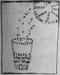 This is the Simply Lemonade redesigned with the influenced of futurism. I wanted to create a design with forms composed of letters/words, just as the futurists carried out. The form is a cup with lemon juice gracefully free-falling into it from a half of a lemon, located in the top right hand corner. I do not feel that this image is as strong as I could have made it, but it does relate well with the work of the futurists.
 This is the Simply Lemonade label with a redesign influenced by the Vienna Secessionists. I drew a lemon in the center to relate with lemonde, as I did with the past designs. My concept behind the design was to create horizontal and vertical alignment with the words, add decoration, and create bold lines, just as the Vienna Secessionists did with Ver Sacrum designs. Vienna Secessionists used a lot of decorative/ornamental elements along the borers and within the backgrounds of their designs. They also use white space very well. Their text was hand-written (obviously mine is because it is a sketch); if I were to digitally create this image, I'd probably scan in hand-lettering. They used vertical and horizontal alignment. Along with this, color was added to the backgrounds.
  This is the Simply Lemonade label recreate with the influence of Peter Behrens. He used a a grid system to create geometric, precise symmetry and alignment. I tried to create a design in the background of the lemon that was horizontally symmetrical. Also, I wanted the border to be symetrical. The horizontal lines (below and above the text) are vertically symmetrical. I tried creating text that Peter Behrens invented, which was shown in Megg's History of Graphic design in Chapter 12. Peter Behrens used all-caps with his text, so I also incorportated that element. He also used sharp angles and alignment. Rectilinear shapes were present in his designs.
 This is the Simply Lemonade redesigned with the influenced of futurism. I wanted to create a design with forms composed of letters/words, just as the futurists carried out. The form is a cup with lemon juice gracefully free-falling into it from a half of a lemon, located in the top right hand corner. I do not feel that this image is as strong as I could have made it, but it does relate well with the work of the futurists.
I really enjoy your last image influenced by futurism. You really experienced with typeface and text to create imagery and it is clear and understandable. If you did decide to do this poster in the future, simple colors would look really good in this poster. Nice job.
ReplyDeleteI think I like your second poster more than the first. Your typeface and layout is simple and the layout is nice. I like the bordering around the edges and the text but maybe watch how much you cover the word "simply". I really like it though!
I favor your second design more than the others. I love how the leaf of the lemon interacts well with the text. It is also very bold and clean. With the first image, I think it would work better if you would have drawn it on the square format that Ver Sacrum was published on...then it would have looked just like it was from the magazine.
ReplyDeleteReeeaaaalllly like the typography and the one with the Peter Behrens influence. I think for the typography you could fill the space in a little more... its kind of empty. Nice detail for the Vienna Secession.
ReplyDelete