Monday, April 20, 2009
Matthew Carter: Thesis
Wednesday, April 15, 2009
Psychedelic Posters
The most interesting thing I learned from this section of Psychedelic Posters was how similar it was to Art Nouveau, even though new ideas were added. The forms were organic and simple, with a flowy look to them, yet the color was much more bold and energetic. Within this poster style and art nouveau, both present motion because of the way the flowy lines are shown. But with the psychedelic posters, much more energy is felt because of the bursts of complimentary colors and swirly letterforms. It’s almost as if everything is coming alive; music can be heard when you look at the psychedelic posters.
The book claimed that many people could not read the lettering, and the style was more colorful and energetic than the previous styles, communicating well with the younger generation. Were the psychedelic posters accepted by elders?
Wednesday, April 8, 2009
Chapter 20: Corporate Identity and Visual Systems; Chapter 21: The Conceptual Image
Chapter 21 was on The Conceptual Image. After the war, a school of poster art opened, which was a union. New trends began to develop, with an interest in Surrealism and the metaphysical. Polish posters included many interesting elements, including, expression, communication, the spread of ideas, darkness, somberness, and surrealism. Tadeusz Trepkowski was a designer who focused on devastation by reducing the image and text to their simplest forms. Henry Tomaszewski carried out new emotions. Waldenar Sweizy created over 1,000 posters, incorporating perfection and the inspiration of folk art. In America, new processes were coming about for printing, paper, and photography. Milton Glaser was a type designer influenced by Art Nouveau, Victorian and Art Deco styles; he used unexpected form and started the Push Pin Studio—a studio where there was a creation of new ideas.
The most influential thing I learned about from chapter 20, how CBS cared more about using creativity while carrying out their designs rather than following a planned system of style, as other organizations/companies used. This brought forth an interest in designers to work for them because they were able to incorporate their own ideas and/or preferences. While looking at the CBS trademark on page 400 in Megg’s History of Graphic Design, it is seen that a layer of clouds are present among the simple shape of an eye and typography. I just looked up a contemporary trademark of CBS and noticed how the two designs compare/contrast. There is definitely more creativity/detail in the 1950s trademark than in the contemporary one. There are more words and clouds are present. In today’s CBS trademark, the letters “CBS” are largely present and positioned next to the same eye used in the old design.
What gave CBS the desire to use creativity for their trademark designs?
Monday, April 6, 2009
Chapter 18: The International Typographic Style; Chapter 19: The New York School
In Chapter 19, immigrants from Europe were coming to America and introducing modern art. The Americans borrowed concepts from Europe, yet they also added their own ideas/approaches to their designs as new forms were made. These new ideas were bringing forth creativity. There was a desire to find new ways to grab the public’s attention. During this time (1940s), America found it important to present their ideas to express ideas and spread information. Originality was desired, along with personal expression. Many influential designers worked during this modern art period in America. Paul Rand was an American designer during this time; he was a promotional and editorial designer for popular magazines. As he worked, he changed visual form and used symbols for visual communication. Collages and montages were preferred by him as he integrated imagery, objects, ideas, and a variety of textures into single compositions. Bill Bernbach worked with the integration of the verbal and the visual. He also began to work more with trademarks and corporation design. In 1946, his book, Thoughts on Design, influenced many other designers; the book included over 80 of his designs. He also worked with symbols, as Rand did, and he understood their universal meanings. He was able to integrate these signs/symbols in his designs. Bernach liked to explore new ideas and show contrast between different elements, such as textures, forms, type, and color. Alvin Lustig was a designer who also enjoyed using symbols within his designs, which were contrasting and abstract. For Lustig, form = content; they were both one. Look magazine hired Lustig as the research director of visual design. Alex Steinbach was the art director of Columbia Records, so, in order to express music, he designed many interesting record covers with the use of shape and form. Saul Bass was a revolutionary designer who reduced his designs to using single dominant images. He was influenced by Rand’s balance of shape and asymmetry. He was the first to make a moving movie title, which was “The Man with the Golden Arm.” He used a cut paper look and also used organic forms/designs. Mike Salisbury redesigned the Rolling Stones magazine.
I found Max Huber’s work to be influential to me from chapter 18. After reading and seeing designs that were black and white, I saw his work and it jumped out at me. I love his use of color. And although his designs look jumbled and complex, they are still well balanced as the book mentioned. I like how there is balance between the rectangular forms and the colors throughout the composition of the yearbook cover on page 358.With Muller-Brockmann’s “Der Film”, I did not quite understand how the rectangles were used throughout the space that was mentioned. How does it work? What were the dimensions of the rectangles?
Sunday, April 5, 2009
Simply Lemonade: Ver Sacrum, Peter Behrens, Futurism
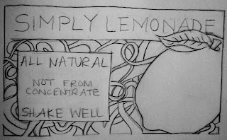
 This is the Simply Lemonade label with a redesign influenced by the Vienna Secessionists. I drew a lemon in the center to relate with lemonde, as I did with the past designs. My concept behind the design was to create horizontal and vertical alignment with the words, add decoration, and create bold lines, just as the Vienna Secessionists did with Ver Sacrum designs. Vienna Secessionists used a lot of decorative/ornamental elements along the borers and within the backgrounds of their designs. They also use white space very well. Their text was hand-written (obviously mine is because it is a sketch); if I were to digitally create this image, I'd probably scan in hand-lettering. They used vertical and horizontal alignment. Along with this, color was added to the backgrounds.
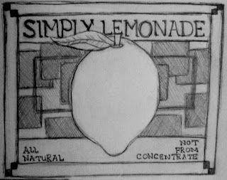
  This is the Simply Lemonade label recreate with the influence of Peter Behrens. He used a a grid system to create geometric, precise symmetry and alignment. I tried to create a design in the background of the lemon that was horizontally symmetrical. Also, I wanted the border to be symetrical. The horizontal lines (below and above the text) are vertically symmetrical. I tried creating text that Peter Behrens invented, which was shown in Megg's History of Graphic design in Chapter 12. Peter Behrens used all-caps with his text, so I also incorportated that element. He also used sharp angles and alignment. Rectilinear shapes were present in his designs.
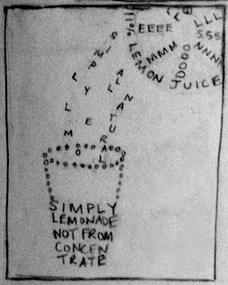
 This is the Simply Lemonade redesigned with the influenced of futurism. I wanted to create a design with forms composed of letters/words, just as the futurists carried out. The form is a cup with lemon juice gracefully free-falling into it from a half of a lemon, located in the top right hand corner. I do not feel that this image is as strong as I could have made it, but it does relate well with the work of the futurists.