Sunday, March 29, 2009

Simply Lemonade: Victorian and Art Nouveau

(Label I redesigned)


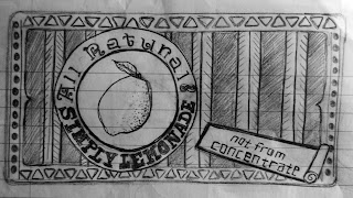
I decided to use the Simply Lemonade label to recreate in the Victorian style. I wanted it to have a variety of fonts, so I found fonts used during that time period and incorporated them into the label. I also wanted to include a picture of a lemon to relate with lemonade, as I did in the label below. Also, I noticed that product names seemed to stand out more boldly than the rest of the text, so I used capitals for the brand name. Many arcs, curves and angles were present in designs during the Victorian era. There were a lot of patterns and ornament used, too, so I also tried to use simple patterns in the label. A simple border was drawn to make the design more uniform; many designs from the Victorian era had elaborate borders.


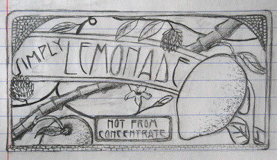
I decided to sketch a new design for the Simply Lemonade label in the style of Art Nouveau. I looked at a bunch of labels from Art Nouveau to get a better of how I wanted to design the label. I love the tiny stained-glass-looking squares from the style, so I wanted to incorporate it into my design. Since curves and floral designs were used with this style, I added some flowy-looking stems, leaves, and flowers. Two lemons are also present to relate with lemonade. I chose the type to relate well with the style, also. Around the entire design is a thin frame, which is seen around many of the Art Nouveau designs.

Thursday, March 26, 2009

Chapter 17: The Modern Movement in America; American Kitsch

This was another chapter I enjoyed reading. I think the designs are becoming so much more interesting as the years progress. America originally rejected modern art. When it was first introduced, they did not accept the European designs because of the typography and graphics integrated in the posters. Americans were used to only seeing illustrations. New fonts were used, like Futura, Kabel, Caledonia, Electra, and Metro. Dadaist and Cubist elements were applied to the works of some interesting designers at this time, including William Addison Dwiggins and Lester Beall. Four other designers were known to have very coincidental circumstances. Erte, Dr. Mehemed Fehmy Agha, Alexey Brodovitch, and Alexander Liberman were all born in Europe, taught in France and helped with the development of modern art in America. Joseph Binder was interesting, for he use an airbrush technique and incorporates cubism and realism into his designs. The WPA was started, along with the WPA Federal Art Project—allowing artists to continue their careers. Many immigrants began coming to America, including: artists, designers, architects, scientists. Modern art was being dispersed throughout the world ever the Nazis caused the closing of the Bauhaus school. During the years of the war, specific posters were made. They were comprised of informational material and cartoons that looked unprofessional. Propaganda posters were also being made. Because of huge historical events, such as Hitler, Pearl Harbor and the world wars, many designers created powerful posters. John Atherton was one who created posters because of gossip/careless talk about the movement of the troops. Ben Shahn composed posters having to do with the cruelty of the Nazis; many people became aware of the brutality. Bayer, the designer mentioned in chapter sixteen with the Bauhaus school of design, was mentioned to have changed his style of design; he eventually made illustrations and type by hand-painting, instead of using photography.

After reading on American Kitsch, I realized how interesting it is that people have so many different views on it. It was said to be an art movement, a lifestyle, and a literature. While people find it to be tacky, it is also seen as being fun and a piece of artwork. I have never heard of the word ‘kitsch’ before, but I have seen the artwork. I have porcelain snowman at my house that my mom bought years ago. I’ve always looked at it and thought how gaudy it looked with the bright colors and the bulkiness; yet I always enjoyed putting it out for decoration. It was weird that I felt disgusted and excited about it all at once, and after reading the different responses people have on kitsch, it’s kind of funny how that happens.

The most interesting thing I learned from this chapter was how designers were incorporating Cubism and Dadaism into their work. Joseph Binder’s coffee poster was interesting, for you could definitely see elements of cubism. There is a woman standing, and her figure is comprised of defined shapes. You can see how geometric and abstract-like the forms are throughout the poster. I think it is so cool how past modern movements are incorporated into later movements—even up until now. New ideas are mixed with the original ideas, bringing forth interesting ideas and designs.

Why did the Nazis want to close down the Bauhaus school?
What makes kitsch so tacky, yet pleasant? I cannot figure it out.

Wednesday, March 25, 2009

Art Deco

During the time of Postcubist Pictorial Modernism, images were man-made, machinery was accepted, and the Allies won World War I. Edward McKnight Kauffer was an artist who incorporated cubism in his work. He made many posters, including underground posters. At first, he focused on making landscapes the destination point for the travelers; he eventually moved on to Art Deco. Art Deco came between the two world wars and got its name from a major design exhibition. It was influenced by many art movements, including: Cubism, Bauhaus, Vienna Succession, De Stijl, and Suprematism. Zigzags and decorative geometry were a part of the Art Deco work. Aesthetics were seen in architecture, design of products, and graphics. Decoration was desired. Jean Carlu was committed to helping his France community; he taught himself how to draw with his left hand, after he lost his right arm in an accident, so that he could present powerful messages through posters. He found that angles and lines represented tension and alertness, and curves represented comfort, relaxation and ease. He combined text with imagery and created intriguing posters of the American war effort. A.M. Cassandre was a designer who also incorporated Cubism into his work; simple planes of color and 2-dimensional shapes, words and images were used. He found that meanings were more powerful with the use of geometric forms—figures, shapes, shadows, silhouettes. Cassandre invented a new typeface for Art Deco, called Bifur. Paul Colin was interesting, for he created his posters by placing forms/figures in the center of the posters and overlapped images giving off a cool effect of colorful bands. Austin Cooper created posters for the Underground Railroad by using warm and cool colors, which communicated well with the viewers. He also took fragments of interesting places and events in Paris and collaged them as compositions. Joseph Binder used natural shapes/figures and used two basic colors—the second color creating the shadows. Abram Games composed emotional posters during the time of war; in one of the, a soldier was shown along with text questioning, “If he should fall, is your blood there to save him?” Many of these ideas were flowing in and out of Germany during this time, as the designers were influenced by Cubism and French advertisements. Printing became much easier as the technology was advancing.

The most interesting thing I learned from this chapter was how Austin Cooper created posters and conveyed meaning through the use of warm and cool colors. I think it is so amazing how color can hold emotion and have great effects. One of his posters is comprised of cool colors, trying to convince people to ride the train because of it being cooler below the ground. It definitely would have grabbed my attention on a hot day. Another poster was the exact opposite, yet having the same effect. The colors were warm, trying to convince people to come down to the underground railroad—out of the cold. Again, I would have been convinced. The posters hold expressions with the use of color.

Did Jean Carlu ever have a passion to help his community before he got injured in the trolley accident?

Friday, March 13, 2009

Chapter 15: A New Language of Form

At the turn of the century, many new changes were developing. Designers, architects and product designers began to focus more on geometric form; form and space were elements being created within their work. The main focus during this time, around the end of World War I, was on form and function. There became a rejection for art taking a political/social role; art was meant to create forms in time and space. Suprematism was a new painting style where form and color were a main focus. Russians were influenced by cubism and futurism, so they came up with the name, cubo-futurism, and used typography and designs in their work.

The most interesting thing I learned was how Kasimir Malevich created artwork with the focus on colors and shapes, without basing the work on values, emotions and pictorial representation. One of his compositions is just a white background with a large black square. Honestly, it doesn’t bring forth any excitement when I see it. As I look at it, it looks like there is depth, as if there is a big hole leading to nowhere—like outer space. I know that if many others were to see it, they may get something out of it, like a certain feeling or story that goes along with it. At the same time, many may see the piece and think nothing of it because it is so simple and plain. I think I like his work because my attention is grabbed much easier when I see less complex designs/art.

What is a leftist artist?

Thursday, March 12, 2009

Day Fifteen: After Class

The topic for class was chapter 14, Pictorial Modernism.

Victoria presented and I thought she did a good job explaining what the modern advertisement posters looked like during this time; they were very simple, with only the addition of a few colors, the object being advertised, and easy-to-read text. The background usually only consisted of a flat color plane. The whole idea of the simplicity was to easily grab the attention of viewers and make sure they would also be able to quickly identify the company of the product. I always think of the McDonald's logo; it's very simple, and most everyone knows what it stands for. Bernhard was a man mentioned, and Victoria went over some important moments in his life. He became interested in colors after seeing an interior decorating exhibition, so he went home and decorated his house without permission. He got in trouble, left home, eventually entered a poster contest for a company that sold matches, and then became a well-known designer. During the time of World War I, posters were commonly used for propaganda purposes and to win the support of society. There was a difference between the posters of the Central Powers (Germany, Austria-Hungary) and the Allies (U.S., Britian, France, Russia). The Central Powers created posters integrated words and images in order to communicate powerfully, and the Allies created illustrations of families and the home because they wanted to protect the traditional values, the home and the family.

The most useful thing I learned was how to better distinguish the pictorial modernism posters, and how they influenced today's posters. They were very simple; intricate designs were not necessary. The text was bold and very easy to read. A very simplified image of the product being sold was placed in the poster with a plain, single color background; the viewer could easily see what was being advertised. We played pictionary--a great hands-on activity--to help us understand how simple, yet identifiable the posters had to be created.

Unlike the Allies, why didn't the Central Powers focus on protecting the family values and the home?
Did Bernard ever contact his family, or did his family contact him, after he left?

Wednesday, March 11, 2009

Chapter 14: Pictorial Modernism

This was another one of my favorite chapters that we have read. The history of graphic design is becoming so much more interesting! In this chapter, it basically talked about how modern art was emerging; design was becoming much simpler and synthetic. Many simplified posters were created for World War I and businesses. Many interesting people were mentioned. Lucian Bernhard became influenced by modern interior decorating after attending an interior design exhibition. When it came to art, he was very talented and entered a poster competition for company that sold matches. His design won, after first being discarded, with a simple background, two matches and the company’s name. Simplicity became vital with successful advertisements and trademarks; past trademarks and advertisements were not distinguishable because they were so busy and did not have a single focus area. Other designers followed in his footsteps, such as Julius Klinger, Julius Gipkens and Hans Rudi Erdt. Erdt applied Bernhard’s ideas very well in his work; a simple product image and the company’s name were placed on a plain, solid background. Posters became very popular during the time of World War I in order to win the support of society. The Central Powers (Germany, Austria-Hungary) created posters integrated words and images in order to communicate powerfully. The Allies (France, Britain, U.S., Russia) created different posters—illustrations of families and the home. They wanted to protect the traditional values, the home and the family. Cubism ended up influencing the modern pictorial images. When modern art was first introduced to America, people got upset and there was chaos. Edward Kauffer and A.M. Cassandre were two designers who were influenced by cubism; cubist elements, like geometric shapes and 2-dimensional compositions, were applied to their work. Cassandre ended up creating an advertisement for Dubonnet liqupor, which became popular for over two decades. He used double contour lines; this created a rhythmic flow of the colors and brought forth unity of the elements applied in his designs.

The most interesting thing I learned in this chapter was how modern pictorial images were created. They were so simple, and yet they were so successful. The same is true today’s advertisements and trademarks. People were actually able to better distinguish which product was being advertised. Today, McDonald’s golden arches are of a simplified trademark, very easily distinguished by most people. Also, something interesting I learned was how Bernhard became interested in interior designs. He went home and redesigned his dull-looking home, and I felt so bad that he was looked down upon for doing so. He was a natural artist and wanted to make his home more interesting.


What happened after Bernhard left his home? Did he ever contact his family again? How did his family react after Bernhard became a famous designer?

Tuesday, March 10, 2009

Day Fourteen: After Class

Yesterday's topic in class was the influence of early modern art from chapter 13. 

I presented on this chapter and told the class about Cubism, Futurism, Dadaism, Surrealism, Expressionism. I showed some images of contemporary work that has been influenced by these movements. I think each movement is very interesting and I'm so glad that I chose this chapter to present because the further research gave me a better understanding of it all. I love each movement because they are all unique in their own way. Cubism used geometric, rectilinear shapes and made collages out of materials while symbolizing the subjects they perceived. I loved how Futurists creatively used text to assemble forms. A lot of meaning was put into their work as they combined images and letters together. Their page layouts looked sort of random, but the intention was to bring forth ideas of the viewers. Dadaism was one of my favorite movements although it is kind of a confusing movement. I understand that they were against art, and they wanted to grab the attention of society by altering already-made objects and making them stand out. But I still am unclear about whether they were purposely making art, since they were against the idea of being called artists. I'm not up for rebellion and violence, but I like how they knew what they liked and disliked; like black and white. They did what they could to grab society's attention. Surrealism was one of my other favorites. I am so fascinated with surrealism now. After learning what their intentions were--using realistic elements, yet not taking gravity or scale into consideration, and creating an overall dream-like situation--I feel influenced. I usually like to paint or draw exactly what I see. Now when I look at everyday objects or nature, my mind starts to play around with it; it's kind of fun. I want to learn so much more about surrealists and other art movements. I love it all. Expressionists created beautiful artwork, whether it looked energetic or somber or right in between. Color and line were exaggerated and created such interesting, unexpected compositions. Some were filled with such energy that you start to feel uplifted and refreshed when you look at them. Others looked dark and mysterious; kind of making you feel sympathetic or interested in what the artist was trying to express. Visual art can really change your mood...like music...it's cool.

The most interesting thing I learned today was that Art Nouveau was the first art movement. I had originally thought that Expressionism or Cubism came first. Knowing that it was an art movement reminds me to really have a better understanding of it and how it influenced or evolved into modern art. 

When the Dadaists took ready-mades and altered them, did they consider them pieces of art? 
Monday, March 9, 2009

Chapter 13: The Influence of Modern Art

This chapter was one of my favorites that we’ve read so far. I have always been interested in learning more on the modern art movements. Before the movements came, there was much change occurring around the world. As said in the previous chapter, at the turn of the century, there was a new desire for brand new designs and typefaces. Organic, curvilinear styles were basically thrown to the side as rectilinear, abstract forms were wanted. Along with this, World War I was about to begin, in 1914, and much confusion—economically, politically, socially, and culturally—was felt throughout the world. Cars, airplanes, movies, and radios were just being introduced. As there was a growth in science and technology, there was much progress in business and trade. Cubism was an art movement that was started by Pablo Picasso and George Braque. Paintings and collages were the basis of their work. The work was comprised of fragments of perceptions of a subject. After perceiving a subject from as many different viewpoints as they could, each view was portrayed in a collage, leaving a geometric, abstract piece of art. The collage consisted of materials from the specific subjects they were portraying and were glued to a painting, leaving a two-dimensional form. This left the cubists with endless amounts of possibilities. Futurism was interesting, for it was an art movement that involved type, and the produced work closely resembles contemporary graphic design. Filippo Marinetti was the founder of this movement; many interesting futurism aspects were brought forth. There was a need to portray speed, energy and noise into their artwork. They were very interested in the war and wanted to incorporate modern everyday life. An interesting addition to design was typography; letterforms were becoming part of images and ornament and eventually began to be used as a way to create form. Poems were expressed by the way the words and letters were placed on the pages. There were no specific margins, for letters and shapes were basically thrown into the compositions. New ideas were only accepted; originality was very important within this group of artists/designers. Dadaism was another art movement; this group actually did not want to be called an art movement since they were anti-art. Their purpose was to pursue freedom. Society was insane because of the occurring war and other destruction going on in the world. Marcel Duchamp is a Dadaist who is most known of. In order for Dadaists to grab the attention of society to prove a point, they took already-made objects and altered them. Although much of their artwork was not seen as attractive, it did not matter because they only wanted to find the best way to grab the attention of viewers—something they definitely did. The Dadaists rebelled; they were in total pursue of freedom and world peace. Because of their work holding so much emotion and meaning, this art movement inspired graphic design. Typography was also used in their artwork. Surrealism was an interesting art movement, for illustrations were created of thoughts and feeling. Realistic characteristics were contributed, yet the entire situation was fantasy and dream-like. Proper perspective, color, and figures were taken into account, but scale and gravity were not. Andre Breton was the man who founded this movement, and he claimed that surrealism was meant to express thoughts with the absence of all control. Viewers were very interested in their work, and much surrealism is seen within artwork and designs today. Expressionism was another early modern art movement. Color and line were exaggerated in the artwork. It was important for emotions to be conveyed. Their main focus was on the poor and social outcasts, and conditions of people and the environment. Two subgroups of expressionism included The Bridge and The Blue Rider. The Bridge created work with emotion through the use of thick, strong stokes and bold statements. The Blue Bridge did not use subjects matters; instead, the spiritual nature of people was expressed through color, line and line. Within some of these movements, the use of typography was important. Photography soon was an important aspect of modern work. Many new styles of art and art movements were formed afterwards up until this day.

The most interesting thing I learned while reading this chapter was how the Dadaists did not want to be seen as artists. It’s kind of funny because their work actually inspired other artists. Meaning was expressed through their work in order to convey something important to the public. For them, what they created did not have to look pretty, for all they wanted was to really draw people in so that they could get their points across. Basically, Dadaists stood opposite against what art stood for. For example, if art was meant to appeal to senses, Dadaists chose to offend. Overall, I really enjoyed reading on this movement because they had an unexpected mind-set.


Were all of the following art movements and styles, up to this day, influenced by the early modern art movements?

Sunday, March 8, 2009

Day Thirteen: After Class

The topic during this class was chapter twelve on the genesis of modern art.

This chapter was presented well, although the presenter was not feeling well. Art Nouveau was a short art movement as the turn of the century came. Many new changes were to occur in the world, including World War I. People were wanting new designs and typography that was not ornamental and organic. Geometric, rectilinear abstract compositions were beginning to form. A specific horizontal and vertical grid was used in order to keep correct dimensions. New desings for architecture were introduced with more space between the rooms. For example, according to the presenter, there was a huge spacial area with the kitchen and livingroom connected; this allowed people in the kitchen to interact with others in the livingroom.

The most interesting thing I learned was how the architecture was designed during this time. New ideas were being used, with space being a main focus. Most homes today are designed that way, including mine. I never really thought about how the design of architecture developed throughout time. It is interesting.

Why did the Ver Sacrum have pages with such strange dimensions?

Saturday, March 7, 2009

Image Five

I was completely drawn to this image when I first saw it because it is so mysterious and fastasy-like. I wanted to find an image that would relate with surrealism, and I think this contemporary piece relates well with this art movement. I found the image online at neosurrealismart.com, among a variety of other interesting contemporary graphics. I was really impressed with the idea of turning a chess board into a body of water. I took a computer art course in the past where we had to create an interesting design with a chessboard -- very similar to this image. I turned mine into a wooden tabletop with bowls and plates of food placed on top of it. So, after working for weeks on the chessboard project, chess boards seem to really stand out when I see them. I believe the function of this image is to give off a specifc feeling for the viewers. Also, it may have just been created for visual interest -- I think it is fun to look at. My mind begins to sort of go off into fantasy land; ideas and stories begin to mold while seeing such an unrealistic setting, although the the objects look very realistic. In my opinion, the artist did a great job with digitally incorporating fantsasy with the realistic-looking objects. The quality of the artwork is great. All of the space is used, atmospheric perspective and accurate proportions are present as a sense of depth is perceieved. Specific textures are used for each object. Although the ship is very tiny in comparison with the chessboard, the overall image is pleasing because the chess board becomes the land and water, The fog surrounding the ship also adds depth to the composition; it runs off the left side of the image, along with the water, giving the idea that the chess board is part of a an even larger body of water. The dark colors in the background set a mysterious mood. It sort of looks like the chessboard is floating in a dark, dreary sky. Overall, this image relates with class since we have approached early modern art, with Surrealism being an early twentieth-century art movement.

Wednesday, March 4, 2009

Chapter Twelve: The Genesis of Twentieth Century Design

I thought this chapter was interesting, for it was the transformation of art nouveau and 19th century art into modern, 20th century art. With it being the turn of the century, change in design was desired. A new form of expression was wanted, along with the addressing of social, economic, cultural conditions. Frank Lloyd Wright was a man who’s work evolved from organic and curvilinear to rectilinear. This American influenced the work of many other designers, especially Europeans. “The Four” was a group of two women and two men designers who also helped with the evolution of design. They also carried out the rectangular, geometric designs. Bold, simple lines with flat planes of color were included in their work. The females of the group tended to create dream and fantasy-like compositions. People were created to look more abstract, and this was not accepted by many people. The Vienna Succession was a group of artists from Vienna; workshops were started, which became popular, but only lasted until the time of the Depression in 1932. Linear and geometric lines/shape became important design elements during this time. A repetition of simple shapes was used. Peter Behrens was a man who wanted to help with the change of type. The first type that he created was Behrenschrift, which was universal and successful. Many did not accept this type because of the curvy, feather-like characters. Behrens was known as “the first industrial designer”. He created designs for products and became interested in architecture; his ideas made an impact on future architecture developments. J. L. Mathieu Lauweriks came up with an interesting grid system for his work. A square was drawn outside of a circle and geometric proportions and dimensions were discovered. With the proper proportions, this system was eventually used with designing buildings, objects and graphics. With the German Association of Craftsmen in 1907, machines became accepted and useful; form and meaning could be incorporated into their designs. Behrens ended up incorporating harmony and proportion with manufacturing and technology. Brehens-Antiqua was a new great type created by Behrens, which became universal and could be distinguished from every other text. During the last decade of the 1800s, the first Underground Railroad was created in London. Frank Pick was essential to the design and type of the signs placed in the subways. A sign with a blue bar, red circle and white text was developed and was so successful that it is still seen today. This sign was created by Edward Johnston, one who was a model for international design. In Germany, Austria and Scotland, Art Nouveau ended as there was a desire for spiritual and societal needs. Inventive space and form was used, which became the foundation for design in the new century.

The most interesting thing I learned was how a new art style was developing as a new century was beginning. Art Nouveau really did not last a long time, and I believe that it was because of the desire for a new design and expression. I think it is interesting how the design ideas evolved so quickly from the organic, ornamental, curvilinear compositions to being rectilinear, geometric, and simple with thick outlines of forms and flat planes of color. I think that this chapter really was a great and interesting explanation of the evolution from art nouveau to modern art. Over the past week I was wondering how and why modern art was formed so rapidly into the new century since I am presenting on early modern art; I now have a better understanding of the sudden changes.

What inspired Behrens to create feather-like type? After seeing it, I noticed how interesting and original it appeared.

Tuesday, March 3, 2009

Day Twelve: After Class

In Amanda's blog, she asked, "Why did the art nouveau movement last such a short amount of time when other design influences seem to have lasted so much longer up until this point?" 

While reading chapter twelve, on the genesis of twentieth century design, it was mentioned that at the turn of the century, there was a desire for change in design. It makes sense that the art nouveau movement did not last very long because it began at the very end of the nineteenth century as soon as the turn of the century was taking place. New ideas were being introduced as organic/floral forms were being replaced with rectangular layouts. The rectangular structure was taking place of the curvilinear elements as geometric style became very important. The compositions were beginning to consist of circles, squares and rectangles; elements were aligned vertically and horizontally to give the compositions balance, harmony and unity. These new ideas/designs became popular and some of the works looked like forerunners of modern art, a new era soon to come.

Monday, March 2, 2009

Chapter 11: Art Nouveau

In chapter eleven, more major changes took place. It was first mentioned how Europe and America were influence by China and that China was influenced by them. Art Nouveau was a new movement that took place after the Victorian Era and before early modern art came; it consisted of decorative designs which became a part of everyday life, beginning in Paris. Many interesting Japanese artists influenced art nouveau in the way that they incorporated new elements to their designs and depicted everyday life. Art Nouveau was influenced by many styles of art, including: Celtic design, Rococo style, the Arts and Crafts Movement, Japanese decoration, Ukiyo-e woodblock prints, European paintings. Ukiyo-e meant “pictures of the floating world”; it was a form of art where screen paintings were decorative and realistic. Art Nouveau used many symbols throughout the artwork. Birth, life, growth, death, and decay were all represented, and there was some confusion and contradictions as to the meaning behind them. Did the expressions stem from the late 1800s? or were the expressions meant to be spiritual, aesthetic, and against materialism? Cheret was an artists who created large posters with simple designs. He experimented with techniques such as scratching, splattering and watercolor. In his work, he depicted women smoking, drinking, wearing low-cut dresses—all ways in which they were not expected to behave. Grasset enjoyed medieval and exotic art; his work reflected these interests. He designed posters and was a competitor of Cheret. His advertisements included women. In England, people focused on illustration and graphic design. Periodicals were used to help spread around the artwork. Aubrey Beardsley was an interesting artists, for he began creating art by using exotic and black and white imagery. He also distorted human figures and Morris disliked his grotesque designs. England actually banned his work. Beardsley eventually developed a more naturalistic style. Many other artists during this time created work that consisted of curves, light, fanciness, symbols, flat planes, forms, vivid color, abstraction, and decoration. Alphonse Mucha was one to create plant-like decorative backgrounds; his compositions were unrealistic and the hair he designed resembled spaghetti. Art Nouveau was passed on to America through newspapers and magazines—the top three being Harper’s, Scribner’s and Century. The designs for Harper’s magazine included people interestingly reading Harper’s magazine. It was humorous and a great idea—it lured people into buying it.

The most interesting thing I learned was how people used Harper’s magazine cover as a way to entice people to buy it. The designs were very creative with the use of vivid color and being influenced by French posters—which had interesting designs with the mixing of text and imagery. On the magazine covers, people were depicted reading the actual magazine. I thought the idea was pretty cool because I see the idea used for modern magazine covers and it entices me to want to buy it. I liked the cover for July with the oblivious woman lighting fireworks because she is so captivated by Harper’s magazine.

The book mentioned that a man named Baron Victor Horta may have started the movement of Art Nouveau. Did he?
What happened to Ethel Reed??

Sunday, March 1, 2009

Image Four

The image that I found looks like an advertisement for Romeo and Juliet from the Art Nouveau time period. The woman looks rambunctious and seductive as she has her head turned toward the viewer. She is animated as her long curled hair spirals and flows horizontally in the composition. The entire composition reminds me of Mucha’s poster (image 11-33 in Megg’s History of Graphic Design) as the woman’s hair looks very similar—like spaghetti. Also, the backgrounds of the two compositions are similar in the way that they look like stained-glass and are very intricately detailed. The typography in the design I found reminds me of the Celtic style. This image was from a Photoshop contest for Art Nouveau Mucha Style at photoshoptalent.com. I was drawn to this image because of the pose and expression on the girl's face and the curvy, flow-like style of the composition. I love the decoration around the border; it has a delicate, nature look to it because of it being so intricately detailed. The color is beautiful; I love how the background is comprised of cool colors with the form of the woman being a scarlet red. This really helps add depth to the composition. Also, the woman grabs the attention of viewers as she sort of pops out. Even the detailed stone-looking background is interesting. It reminds me of stained glass. I love this composition because was created to resemble Alphonse Mucha’s work of the Art Nouveau style. The Art Nouveau style was interesting because it was period that came after the Victorian Era and before the introduction of modern art. This image relates with what we have been covering in class because we have just covered the Victorian Art period, and moving into the period of Art Nouveau.